MagicTracker Has a Front Door Problem
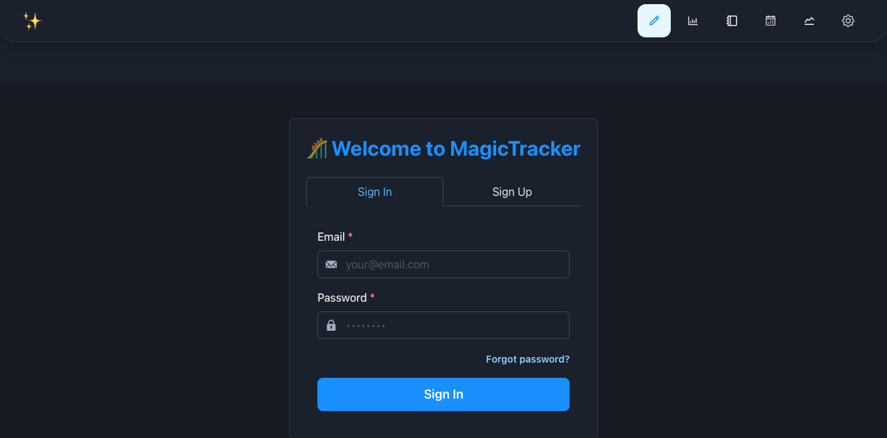
MagicTracker works. It also makes a brand-new user hunt through Settings to do the one thing the application is built around: create a trip.
That distinction matters. The production site is not collapsing under obvious rendering failures. Its pages load, the mobile layouts fit, and the underlying feature set is substantial. The trouble is the connective tissue. Navigation, empty states, and first-run guidance do not agree on where trip management lives.
The main problem is not visual
A fresh account lands on the Dashboard and sees No Active Trip. The page says to go to Settings, but it does not provide a button or link. Events, Calendar, and Wait Time Analytics repeat roughly the same dead end. Charts goes the other direction and fills the screen with zeros, N/A values, and empty statistics that look authoritative even though there is no trip to measure.
There is a dedicated My Trips page, but it is missing from the global navigation. That page tells the user to create a trip, then offers only a Refresh button. The actual Create New Trip control is tucked inside Settings under a tab named Trips.
This is the first repair: make Trips a normal, visible destination and give every no-trip state a direct Create Trip or Select Trip action. Settings should hold preferences. It should not serve as the application’s hidden front door.

The trip form punishes mistakes
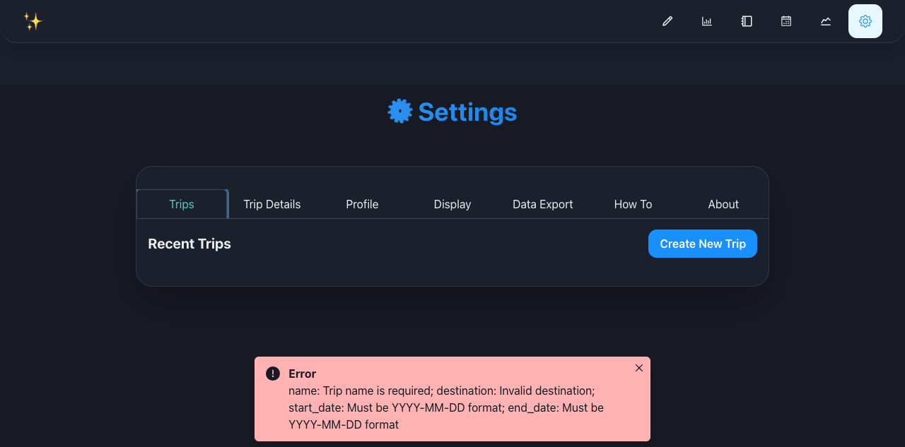
The create-trip dialog has a more concrete failure. Submit it without the required fields and the server correctly rejects the request. The interface then closes the dialog, throws away the form state, and flashes this message:
name: Trip name is required; destination: Invalid destination; start_date: Must be YYYY-MM-DD format; end_date: Must be YYYY-MM-DD format
That is an API response, not useful interface copy. Required fields need to be marked before submission. Date rules belong next to the date controls. A failed request should leave the dialog open with the user’s work intact.
The destination list also contains duplicate Hong Kong and Shanghai entries backed by different database IDs. That is not a cosmetic duplicate. It can attach a trip to the wrong location graph. We will consolidate the records, migrate dependent data, and add a uniqueness constraint so the problem cannot quietly return.
Recovery links should recover
The email-confirmation failure screen looks finished, but all three of its recovery links lead to 404 pages. Back to Login points at /auth/login, account creation points at /auth/signup, and support points at /support. The working authentication interface is /login.
There is a separate configuration problem in the signup email flow: account activation succeeds, but the final redirect still points at localhost:3000. That fix lives in the Supabase project configuration, not in a prettier error card. Both pieces need to be corrected and then tested with a completely new account.
Mobile Settings hides part of itself
Settings has seven categories. On a phone, only four are initially visible. The remaining three sit off-screen in a horizontally scrollable tab strip whose scrollbar is explicitly hidden. There is no clipped next tab, edge fade, or chevron to suggest that the row moves.
A settings category selector will work better on narrow screens. It is less clever and more obvious, which is exactly what Settings needs. We are also separating trip management from actual preferences, reducing the number of categories that need to compete for space.

The visual cleanup
The current interface leans on familiar dashboard ingredients: oversized rounded containers, emoji in headings, icon-only navigation, repeated centered empty states, and bright accent blocks that carry more weight than the content. None of those choices is terrible in isolation. Together they make the product feel assembled from a template.
The redesign will be quieter. We are treating the Dashboard as a monitoring surface, Trips as an operating surface, and Settings as a configuration surface. Each gets a composition suited to the job instead of the same card treatment everywhere.
- Navigation will use plain labels for primary destinations and reserve icons for reinforcement.
- Trip status and next actions will sit above secondary metrics.
- Empty states will explain the state and offer one useful action.
- Cards will group related information, not decorate every section.
- Emoji headings and ornamental gradients will go.
- Color will indicate state or action rather than fill space.
- Corner radii, shadows, and borders will use a smaller, consistent scale.
The reference point is a restrained product interface: near-black and neutral surfaces in dark mode, warm off-white surfaces in light mode, crisp typography, thin borders, and one controlled accent. It should still feel like MagicTracker, not a copy of somebody else’s dashboard.
The work order
- Make Trips visible and repair first-run empty states.
- Fix trip-form validation and clean the destination data.
- Repair signup confirmation and every broken recovery link.
- Replace the mobile Settings strip and simplify signed-out navigation.
- Correct the built-in guide, invitation error state, and 404 page.
- Remove avoidable network errors and run the same production review again.
The findings are tracked publicly in the MagicTracker issue list, beginning with the first-run trip flow and the create-trip form. The existing signup-confirmation issue remains part of the same pass.
The useful news is that this is fixable without throwing the application away. MagicTracker already has most of the pieces. They need a clear order, better defaults, and a front door that does not send people into Settings to begin.